

![[SPIED] Redesigned 2026 Corvette Interior Caught Fully Undisguised](https://www.corvetteblogger.com/images/content/2025/04/042825_102.jpg)
The Corvette Team made what we think was a poor decision in not bringing a new 2026 Corvette to the NCM Bash over the weekend to show off what everyone already knows is coming…the redesign of interior’s dash screens and center stack. At least then they could have controlled the narrative about the changes. Sadly, they skipped the opportunity to share it with the Corvette faithful live and in person at the Bash and instead, enthusiasts now have pictures of the fully revealed interior design from a spy photographer on the Monday following the Bash event.
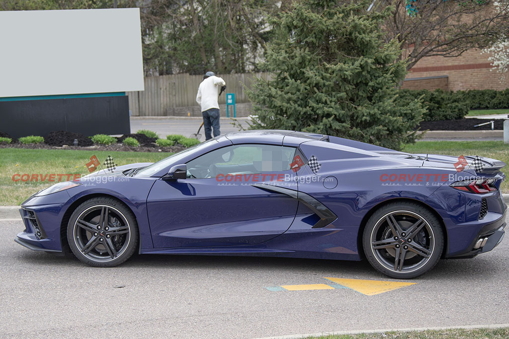
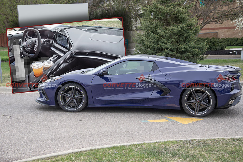
Our spy photographer captured the new interior inside a Hysteria Purple 2026 Corvette Stingray that was driving in Michigan. Previous spy photos showed heavy camo covering the dash, but now it looks showroom ready according to our photographer.
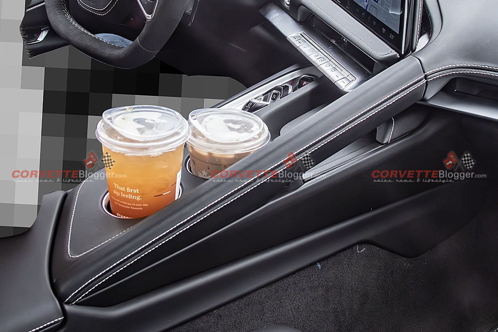
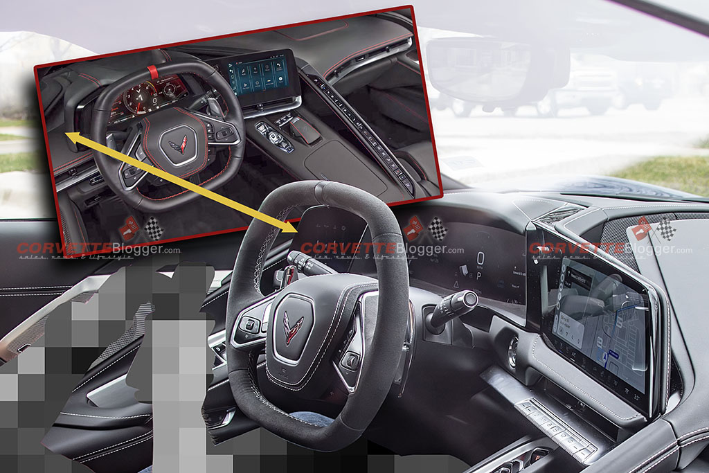
The photos confirm what we all know was happening…gone is the Great Wall of Buttons, but not so much as the partition that separates the driver and the passenger are still there. The new wall has a grab handle for the passenger while the center console has two open drink holders.
![[SPIED] Redesigned 2026 Corvette Interior Caught Fully Undisguised](https://www.corvetteblogger.com/images/content/2025/04/042825_104.jpg)
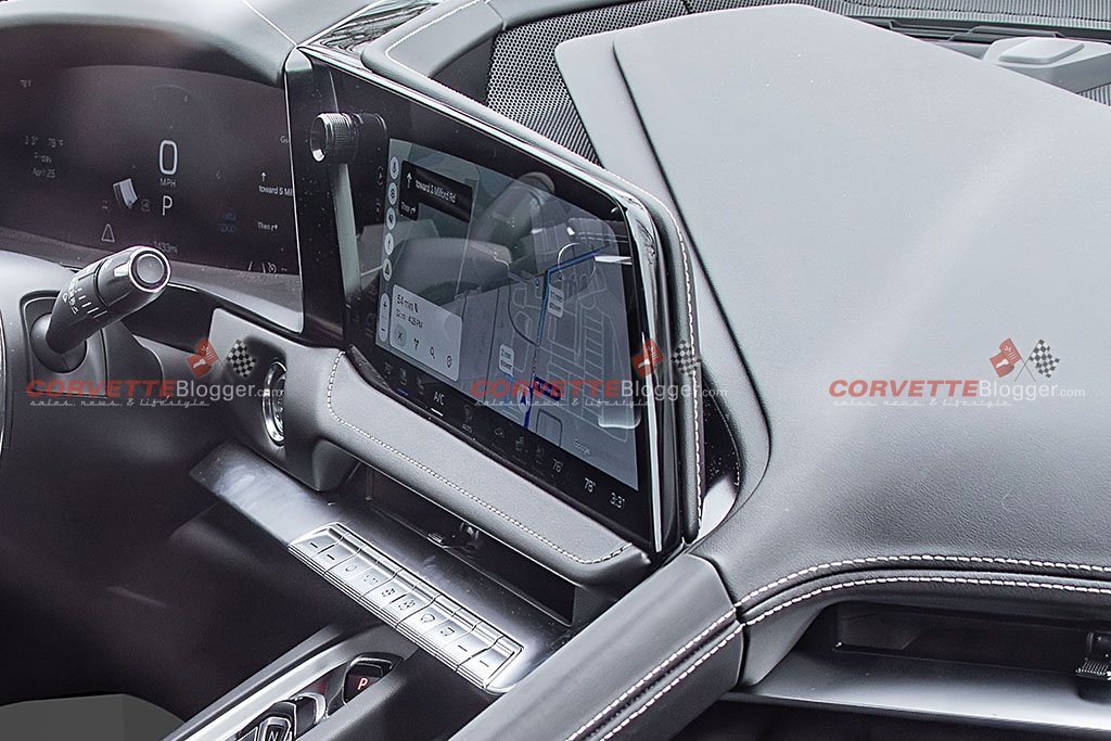
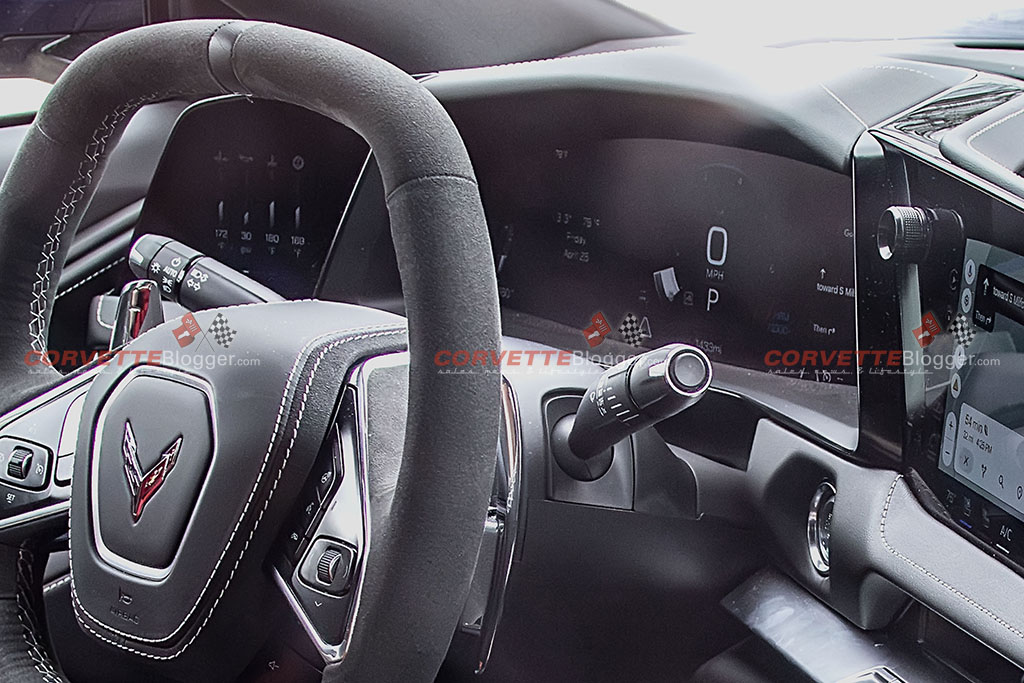
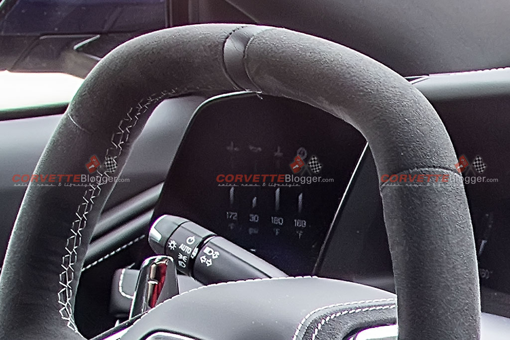
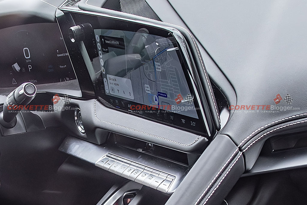
The biggest change in our opinion is that the driver will now have three different screens in front of them. Over on the very left, we see a new screen that offers configurable data to the driver which may including items like engine and oil temps. The middle screen will have a new display that is completely different than what was there before. We assume that this will mean updated displays for each of the Driver Modes and the customizable information that surrounds each of them. Finally, the new center infotainment screen does look larger in size. On the bottom row of the screen display, we can see info about the HVAC controls.
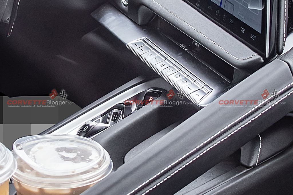
That center screen is stacked on top of a leather bolster. Under it is the heating and ac vent, and below that is a shelf or ledge that contains the individual toggle switches for the HVAC system. Zooming in, we can see the controls for Power On/Off, Auto, Fan Speed, Defrost and a few other buttons that are not labeled.
![[SPIED] Redesigned 2026 Corvette Interior Caught Fully Undisguised](https://www.corvetteblogger.com/images/content/2025/04/042825_111.jpg)
We can also see what has been alleged in previous spy photos to be the new phone charging pocket next to the grab handle, but the one item not in view is the Driver Mode Selector which is supposed to be just below the transmission shifters. We have been told by those in the know that the Drive Mode selector “knob” has been replaced with a toggle switch as well. One other tidbit that we learned over the Bash weekend is that the cup holders are different sizes in diameter to accommodate a variety of cup or bottle sizes. Inside the bottom of the cupholders are LED lights, but those aren’t shown in these photos either.
You can see all the photos below, but we really want your opinion on the new design now that it has been presented to us. Let us know your thoughts in the comments below!




Source:
Photo Credits: Glenn Paulina – KGP Photography
Related:
[SPIED] Take Another Look at the 2026 Corvette’s Redesigned Interior
MotorTrend Says An Interior Redesign Is Coming For The 2023 Corvette
[SPIED] Corvette Engineers Testing 2026 Corvettes and We May Have First Glimpse at New Interior
Subscribe Now:

![[VIDEO] Watch a Corvette ZR1X Run the 55th Annual Virginia City Hill Climb](https://www.corvetteblogger.com/images/content/uploads/2026/09/093026_1-218x150.jpg "[VIDEO] Watch a Corvette ZR1X Run the 55th Annual Virginia City Hill Climb")

My thought are the only reason the 26 wasn’t presented at the Bash is GM needs more time and they don’t want to put any more hurt to the 25 sales than they are experiencing currently
The cat is out of the bag – many people were deferring orders until the new interior was ‘confirmed’. I think at this point that those who want the new interior will wait – and everyone else will get a good deal on the ’25 cars on dealer lots that will need to find new homes. I too was thinking of waiting, but when I had the chance to order a Z06 late last model year (’24) I took advantage of it. For me, in my opinion, this new change is good (especially the new small screen on the left, if it does indeed show engine/performance info specifically) but not a radical change. The new ‘wall’ with the grab handle reminds me of my C7 Grand Sport which I thought was cool – but there still is a short ‘wall’ nonetheless. Just my thoughts!
Long overdue. Been saying for a while that the space to the left of the instrument display is just wasted space on the dash. I’m curious if the blank buttons on the ends of the new panel (next to the power button and I think defrost button) are user configurable, or fixed function. If they are user configurable–that is bang-on the kind of thing that was needed.
I like it. I do want to see what they’ve done with the waterfall. Start from scratch and put a proper speaker there, I’d love that.
I think it is a very good evolution. I think the grab handle is not practical in that the placement seems to far forward for the passenger. It that is the case then I ask “what is the point?”
Sorry for the poor edit.
I wish those HVAC control buttons are in black so it does not reflect sunlight.
Well don team “Vette. Nice changes, a good evolution!
Take my Money!!!!
phone charger is much better but rest of changeis kind of a negative as more lights at night to distract you and less easier hvac buttons and grab handle is in stupid spot. prefer the original setup but its all good in a great vehicle
I find to many screens can be a detraction. With so many people talking on their phones, drinking coffee, putting on makeup, and whatever else they do, that’s the last thing we need is people reading their dashboards.
The A/C buttons look cheap. With the price they charge for this car they should not be including anything that can be found on the Chevy line. This masterpiece should stand on its own.
BTW I own a ’21
Does the passenger really need a grab bar at all? GM could clean the console even more by elimating it altogether. I love the C7 console.
I agree with Mike’s post . What’s the point?
I actually prefer the wall of buttons over this. And I don’t like the exposed and different sized cup holders, but at least now I have room for my Foster’s Oil Can and my wife has a slot for her Truly…🤪🥳🤷♂️
Well, it’s nice but not enough for me to wait. If I can get a great deal on a 25′ then I’m going to go for it. Not enough change for me to wait and pay an inflated price for it. Either way, it’s a Corvette so what’s not to like!
Not a fan of open cup holders, especially in a Corvette. Open cup holders belong in mini vans and faux SUV’s. They’ll cheapen the look of a Corvette’s interior.
Guys, the C7 grab handle was about in the same place. Wasn’t it?
Like my 23 HTC Z51 wall of buttons even more now. Don’t care about more screens or prominent cup holders…..I drive my 23 watching the road and traffic with both hands on the wheel.
I dig it.
Looks too busy with too much going on.
Open cup holders look unfinished. I kinda like the wall of buttons. The charging station placement is better though, and a different mode selector method is a good idea… I’ll wait to see more. In the meantime, I’ll be driving my fabulous ’22 Stingray!
Dislike the entire design. So glad I have my 25 ZO6 with the best interior of any generation.
The grab handle looks cheap as does the open cup holders.
Another step backwards.
The wall still exist but is now useless. The HVAC controls are a little harder to access vs. the buttons on the wall. The dash is to busy, but nice looking. I know there are haters of the wall but it worked.
Good improvement overall, the phone charger location is much better however they had to do away with the ride select controller, will have to see it in person. I would not pass over a 2025 to get a 2026 just for this, not to mention the base MSRP probably shoots up another $2k.
It’s still a barrier between driver and passenger. Personally, although I really don’t like the wall of buttons, I like this even less. Why not just get rid of it altogether and limit the functionality of the touchscreen to those that don’t need to be used while driving? Buttons, toggle switches, etc. for those functions that are used while driving.
That center screen is not only intrusive but slightly blocks 45% sight line to the right.
Like so many vehicles today in the quest for of bigger and bigger screens has taken on the look of an ‘add on’.
Come on everybody, buy up the left over inventory of 24s and 25s so GM can roll out the new model and get their pricing going in a different direction.
Good and bad. If this is the 2026 solution, I think more work is needed. More customer feedback needed…
I prefer the hideaway cup holder/sunglass storage of my 2024 Stingray. Don’t need a grab bar. An opportunity was lost to reduce or get rid of the unnecessary passenger wall separation. My main complaint about the wall was that the LED buttons needed to be brighter or larger.
HVAC control location is ergonomically better in the 2026 design. But aesthetically it doesn’t integrate well – just hangs out there… Needs black buttons, not silver like someone else mentioned.
I will be purchasing a C8 ZR1 in a year or so. I already didn’t like that the roof and nacelles are blacked out as standard – with no option to keep them body color. Looks horrible in a convertible – like a 1/2 height ghetto car. Those blacked out parts only integrate well with a black car – which is a color I would never choose. I prefer the HTC, but may have to get a coupe so I can choose a body color other than black.
Well, you can only buy what they sell… Is there a web site or email address to send design suggestions to GM – specifically Corvette? Whether they take it or not, it doesn’t seem right to do nothing…
@Michael – I doubt the infotainment is blocking visiblity to the right. It’s probably just obscuring more of the dash. Doubtful it’s even blocking view of the fender.
@Rc – Don’t blame me. The opportunity to buy a new AYM E-Ray has long since expired. I’m not paying full price for a color/combo I don’t want…let alone one that is over-represented in production numbers.
@Bob – I agree about silver buttons being suboptimal. GM didn’t even figure out how to make the existing stealth trim fully match. As far as the HTC, no idea. I happen to believe that a blacktop canopy looks better and works better visually–but the issue with the ZR1 is all of the boy-racer bits that can only be had in black. With SR and ER, you could body color the remaining bits down low–and end up with a solid, 2-tone looking car (black on top). If all of the vents and openings are now black, you would need to have the entire body be one color–otherwise it looks too disjointed. If you could order the ZR1 HTC with every vent and opening in body color–the black top and nacelles on the HTC would look very upscale and nice.
Didn’t anyone notice the shape of the Steering Wheel has changed? It looks elongated, and may interfear with your exit, even with the Wheel all the way up. Also no mention of Addaptive Cruise Control. Love my 22 Stingray!
I prefer the wall of buttons in my 2020. can operate them without even looking. And the cup holder should close, Phone relocation is the only plus for me,
Open cup holder looks cheap, so do the HVAC buttons. I have never been a fan of the digital dash. I love my C6 Z06 instrument cluster. There is no better set up in my opinion. I hope that Chevy will provide the option for a simulated analog gauge configuration. Maybe the reason they didn’t present the new interior is that they know it still needs some work.
To your point about bringing a ’26 version to the BASH: You fire guys like Harlan Charles, who possessed the most intimate array of customer knowledge, and leave the rest to the fools that fired him, these are the empty-headed decisions you get.
Bring back the WALL with those switches. Was convenient for passenger so they can have access to switches as well. Too much viewing for driver with change of switches location!! Two size cup holders!! Are we at the movies or driving a car. Talk about distraction! Was kind of annoying to adjust mode knob with water bottle, now having access to large and small cups.
Eye viewing should be direct up front and not to left as well. The HUD was good enough. The cell phone was my major concern. Very difficult to take out of slot when leaving car. If phone did not have a FAST CHARGER built in initially, phone was not charging!! Overall, we do not need another increase in car because of a change in location of switches!!
Re: CupholderGate 2025 – I maintain the cupholders are both the same size. I appeal to the Board of Cupholder Equalization on this matter.
Just admit the gaping holes are an eyesore and a danger to all fast drinks everywhere. Good post W+P
Dan W. Just looking at the photos….information overload, 10lbs of stuff in a 1lb bag. looks messy. Black buttons must happen not silver, Not sure the driver will know where to look first. With all the digital displays does that mean no more heads up display? Bad decision. Kind of sort of think the customer wasn’t consulted in the redesign, just friends and family. Oh well I’ll wait to see it in the flesh!
Comments are closed.